
Machine Shop Website Navigation: Help Buyers Find the Right Capability
A buyer lands on your machining page from search. They need to check whether your shop handles their material, understand the inspection information available, and find the right way to request a quote. Your website may contain every answer. If the labels and links hide those answers, the buyer still has work to do.
Machine shop website navigation should connect a buyer’s question with a useful destination and a sensible next step. That includes the main menu, capability links, breadcrumbs, mobile controls and the route into your RFQ process. It also includes what happens when someone arrives halfway through the site rather than on the home page.
This guide provides a practical way to organize those routes, test them and maintain them as your content grows. The examples are planning examples, not claims about a particular shop’s services or results.

Start with buyer tasks, not your organization chart
List the questions people need answered before contacting you. Ask sales and estimating which pages they send during real conversations. Include technical reviewers who can explain where a page might imply more than the shop actually offers.
Useful tasks might include finding a process, checking a material, reviewing quality information, locating an approved project example, and learning what belongs in an RFQ. Write each task as something a visitor wants to do: “Find the dimensional limits relevant to this process” is more testable than “Explore our excellence.”
Assign each task a primary destination. If no destination exists, record a content gap. If several pages compete, decide which should answer the question and how the others should link to it. A new menu cannot resolve contradictory capability claims.
Use your machine shop content strategy to decide what deserves a page. Use the navigation plan to explain how a buyer reaches it. These decisions belong together, but they are different work products.
Give the main menu a clear job
The main menu should expose the site’s major useful sections. It does not need to display every capability, blog category, company milestone and downloadable file at once.
A small shop might start with Capabilities, Industries, Quality, About and Contact, plus a clearly identified Request a Quote action. That is an illustrative structure, not a universal menu specification. A shop with a narrow specialization may need fewer sections; a broader operation may need useful overview pages beneath a different grouping.
Keep the meaning of each section distinct. Capabilities explains what work the shop performs. Industries provides relevant application context. Quality explains the documented information buyers can review. About introduces the business and people. When all three first sections repeat the same generic paragraph, the menu offers choices without useful differences.
Give the logo a conventional link to the home page, and make important actions recognizable in text. A stylized icon alone may leave a visitor guessing whether it opens a menu, downloads a document or starts an inquiry.
Name destinations in language buyers recognize
Labels should predict what happens after the click. “CNC Turning” tells a reader more than “Solutions” when the destination describes turning. “Quality Information” is clearer than a decorative slogan when the page contains inspection context and document-request instructions.
Collect wording from actual inquiries, public search queries when available, and conversations with customers. Separate unfamiliar internal department names from terms buyers use. Test a proposed label by asking someone what they expect behind it before showing the page.
Keep recurring labels consistent. If a header says “Request a Quote,” avoid calling the same destination “Start Your Journey” in the footer and “Connect” on capability pages. Contextual links can describe a specific purpose, but the action should remain understandable.
Google’s link guidance recommends crawlable links and descriptive anchor text. Apply that principle to ordinary links as well as menu items. “Review our equipment list” sets a useful expectation; a repeated “Learn more” gives less context when read separately.

Build capability hubs that help people choose
A capability overview page can act as a useful junction. Explain the differences between the available processes, link to the relevant detail pages, and provide a route for buyers who are unsure which process applies.
Avoid a page that is only a wall of unexplained links. Add a short description beside each option. Explain the kind of question the destination answers without making unsupported suitability recommendations. Keep detailed working envelopes, materials and qualifications on the technically reviewed page that owns them.
For a deeper structure, use a clear parent-and-child relationship. A buyer should understand how a process page belongs to the capability library. Repeat useful child links on the parent page so visitors can reach them without operating a drop-down menu.
Connect the detail page to equipment information, quality information and relevant examples where those destinations help answer a real follow-up question. Our capability page guide explains what the destination itself should contain.
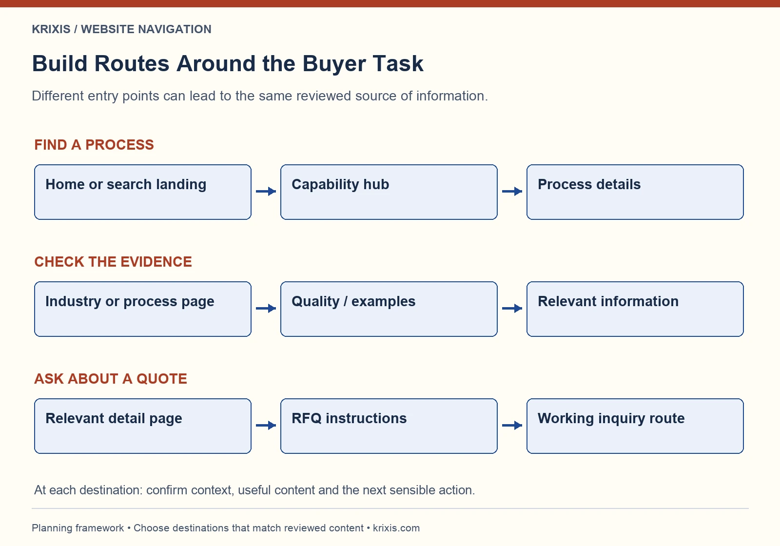
Connect industries and evidence without duplicating pages

An industry page and a capability page should provide different entry points into related information. An industry page can explain application context, the information a buyer needs to share and the relevant processes. It should link to the pages that explain those processes in detail.
Do not create a duplicate process page under every industry simply to repeat keywords. Where one reviewed page answers the technical question, link to it from the relevant contexts. This keeps updates manageable and reduces the chance that two pages describe the same capability differently.
Use project evidence carefully. A link to a machine shop case study should identify what the example helps explain, such as a documented project challenge or an approved process description. A navigation label should not turn one project into a general claim about every future job.
For the industry entry points, follow the planning questions in our industry page guide. Keep routes useful even when the buyer does not identify with a particular industry category.
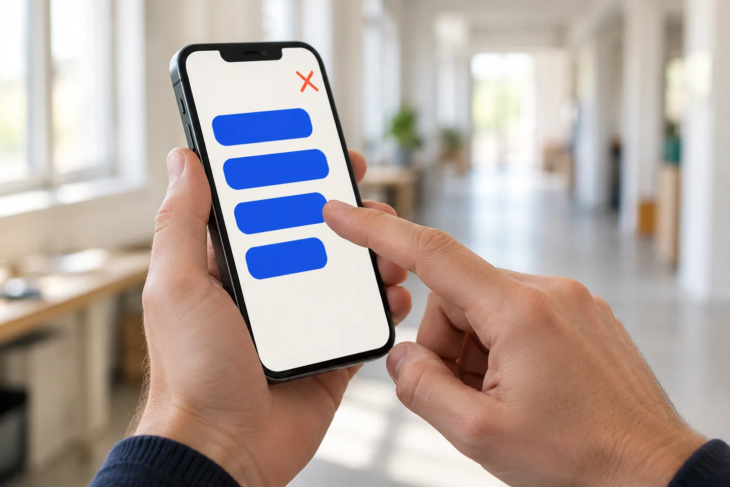
Make mobile menus and keyboard routes usable
A menu that opens on hover can behave differently on a phone or when someone uses a keyboard. Test the actual controls instead of assuming the responsive layout has solved the interaction.
Check whether a visitor can open the menu, identify the expanded section, follow a child link, return and close it. If a parent label is also a destination, give the expand control and the page link clear, separate purposes. Avoid a first tap that unexpectedly navigates away when the visitor meant to reveal choices.
With a keyboard, check visible focus, a sensible order, usable expand-and-collapse behavior and a clear route back to the page. Confirm that hidden links are not creating a confusing sequence. Test zoom and narrow layouts for clipped labels, overlapping controls and a quote button covered by another element.
W3C’s menu structure tutorial explains semantic organization and identification of navigation regions. Its fly-out menu guidance covers interaction considerations and alternative access to submenu destinations. Use these resources with a competent implementer; a quick visual review does not establish accessibility conformance.
Support visitors who enter through a deep page
Imagine a visitor arriving directly at a turning page, a quality article or an older case study. They have not seen the home page introduction. The page should identify its subject, provide context and offer useful onward links.
Breadcrumbs can explain the page’s place in the site. Keep the trail understandable and make its parent destinations real, helpful pages. Do not use a breadcrumb to imply a hierarchy that the actual content does not support.
Contextual links answer the next question within the content. A material discussion might link to the relevant process page; a capability page might link to the RFQ instructions. Choose these links while editing the page rather than automatically attaching every related topic.
Search and an HTML sitemap may provide additional routes as the library grows. Search needs useful results and maintenance, not just a magnifying-glass icon. W3C’s multiple-ways tutorial explains how breadcrumbs, sitemaps and search can help different navigation needs. An XML sitemap for crawlers serves a different audience from a readable page directory.
Make the RFQ route visible and explain the handoff
Request a Quote should be easy to recognize from important capability and evidence pages. Explain what happens next, what information helps the estimator and where buyers should ask a preliminary question if they cannot yet provide a complete brief.
Link to a destination that actually handles the action. A button labeled Request a Quote should not leave a visitor searching a general contact page for an unexplained email address. If email is the available route, say so and provide usable instructions.
Keep ordinary questions distinct from drawing submission. Publish the approved sharing instructions and avoid suggesting that a generic form or email address provides a security capability it has not been verified to offer. A marketing page can direct a buyer to the responsible person without inviting unnecessary sensitive uploads.
Review the complete RFQ form and estimator handoff, including receipt behavior, ownership and follow-up. Navigation has done only part of its job when the visitor reaches the form; the next step still needs to work.
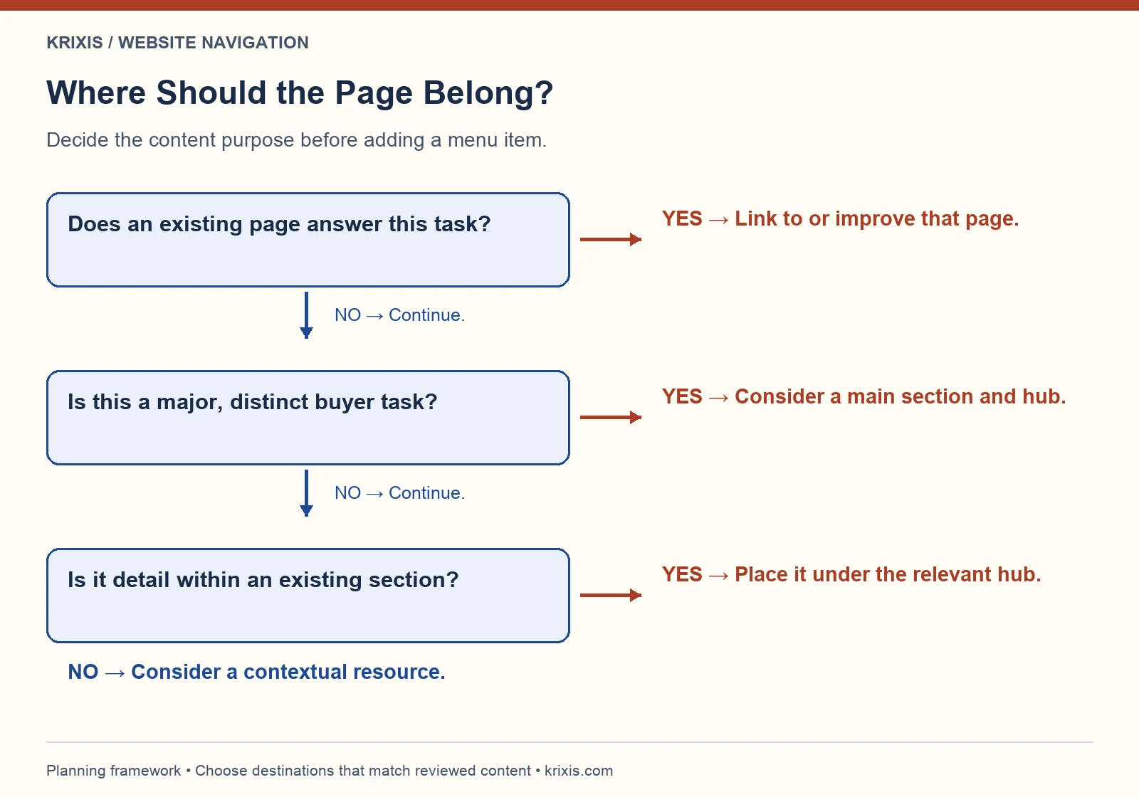
Decide where a page belongs with a simple test
Before adding another main-menu item, ask whether the page serves a recurring, distinct buyer task. Then decide whether it is a major section, a detail within an existing section or a contextual resource linked from a relevant page.
A substantial new process may warrant a capability detail page. A brief explanation of a term may belong within that page. A planning guide might belong in resources with links from the pages where it helps. There is no benefit in expanding the navigation faster than you can maintain the destinations.
Check for existing pages before creating a new one. If a destination changes, plan the URL, internal-link updates and any necessary redirect as part of the change. Use the website redesign and migration checklist when changes affect established addresses.
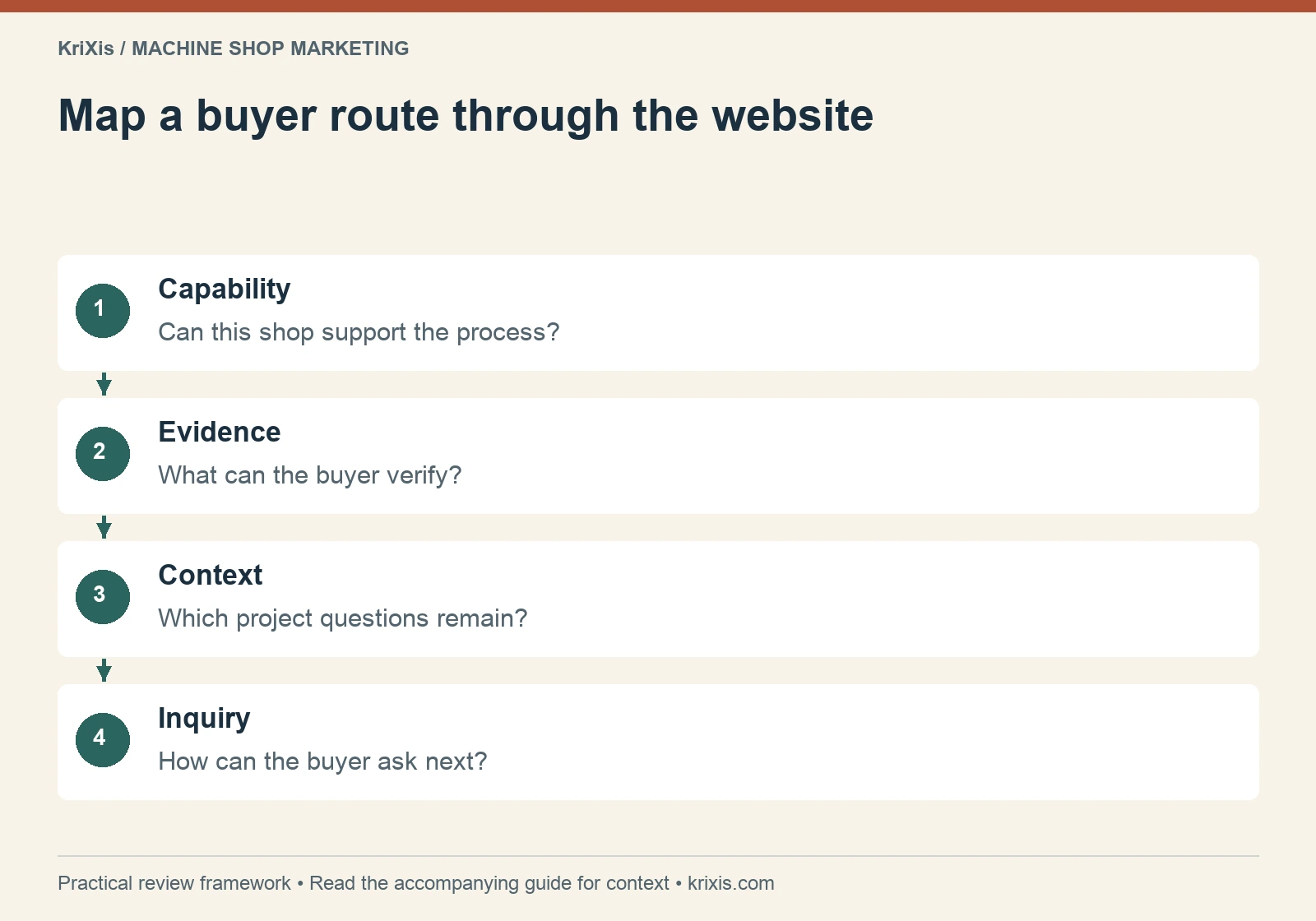
Read this graphic as text
- Capability: Can this shop support the process?
- Evidence: What can the buyer verify?
- Context: Which project questions remain?
- Inquiry: How can the buyer ask next?
Test tasks without coaching the participant
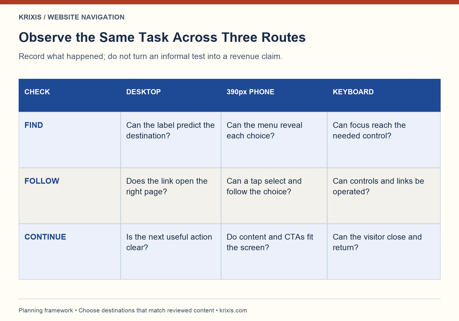
Give a reviewer a realistic question and a starting page. Ask where they would go first, then let them navigate. Record what they expected, what they clicked, where they hesitated and whether they found enough information to choose a next step.
For a fictional test, start on a case-study page and ask: “Find the turning information, locate the quality information, and identify how to ask about a quote.” Do not tell the participant which menu label contains the answer. If you have to explain the navigation, record that as an observation.
Test several entry points and include a phone and keyboard route. Record completion and wrong turns alongside the visitor’s explanation. A small informal test can reveal a confusing label; it cannot establish a reliable conversion improvement or represent every buyer.
Prioritize a broken or misleading route before a minor visual preference. Retest the same task after a change so you can compare the behavior you actually observed. Keep the task wording and conditions in your worksheet.

Measure and maintain the routes you publish
Use available search and analytics data to identify entry pages, internal search terms and movement toward useful inquiry steps. Define events carefully: opening a menu, clicking an RFQ link and submitting an inquiry are different actions. A click is not a qualified lead or a won job.
Combine those observations with sales feedback. If buyers repeatedly ask where to find quality documents, examine both the label and the destination. If a page receives few visits, first check whether a relevant route exists and whether that route is clear. Do not automatically delete a useful technical page because it has a small audience.
Google’s sitelinks guidance favors logical structure and links to important pages. Sitelinks remain automated; restructuring a menu does not guarantee a particular search appearance or ranking.
Assign an owner to each important route and review it when capabilities, content or contact responsibilities change. Keep a change log with the previous label, new label, destination and test result. This makes navigation a maintained part of the sales process instead of a one-time design decision.
A practical starting plan
Choose one important buyer task and trace it from the home page, a search landing page and a relevant article. Confirm that the destination answers the question and that the next action is understandable. Fix the clearest obstacle, then repeat the task on mobile and with a keyboard.
Once that route works, extend the method to the rest of the priority tasks. The goal is a coherent set of paths that your team can explain, your buyers can use and your content owners can maintain.


Trackbacks & Pingbacks
[…] connect this content library with clear menu labels, capability hubs and mobile routes, use our machine shop website navigation guide and its task-testing […]
[…] your machine shop website navigation plan to identify the actual route between these pages. Check it on a phone and with a keyboard. Note the […]
[…] help buyers reach this page from a menu, industry page or shared link, use the machine shop website navigation guide to plan labels, capability hubs and the next useful […]
Leave a Reply
Want to join the discussion?Feel free to contribute!